
. > FOCUS > SCIENCE & HUMANITY
From imagery to scenarios: Visualization of data news
Author : GUO WENCHEN and WU YA’NAN Source : Chinese Social Sciences Today 2021-11-17
In the big data era, to give better play to the vital functions of news media in generating insights into, disseminating, and imparting information, “data news” has come into being.
Defined from the perspectives of presentation form and production process, data news is a new paradigm with data as the object of analysis, visualization as the presentation method, and the results of data processing and analysis as the interactive driving logic. In the past decade, many emerging communication technologies, creative tools, and production concepts have emerged in the field of data news production.
Driven by various tools and techniques, the visual pattern has also been continuously shaped. This article investigates the visual production of global data news from the perspectives of design practice, media technology, and user experience, so as to outline and elaborate the shaping process and innovation direction of visualization.
Sensory awakening
Visual symbols are carriers composed of factors such as shape, direction, color, and size to convey a message. Visual symbols form different landscapes through arrangements and combinations. There are two trends in the use of visual symbols in data news visualization practices: first, the form and category of visual symbols have developed from simplification to diversification, the content of scenarios has been expanding, and visual characteristics have become increasingly obvious. Second is to highlight the artistic expression and visual attraction of visual symbols, with the continuous improvement of the tension of the scene and richer visual connotations.
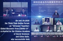
The data news reports in an early stage, often composed of words and simple statistical charts, failed to demonstrate significant characteristics of visualization. For the data news produced by The Guardian before 2010, the text took up a large proportion of the report, with monotonous chart styles and most of the data information directly presented as figures. In the next few years, more data charts such as scatter diagrams and bubble charts appeared one after another, and the characteristics of visualization gradually emerged. In addition, dynamic visual symbols such as graphics, animations, and videos are also used more frequently. For example, the “70 years in figures” produced by China’s Economic Daily renders monotonous and boring data into a series of short videos to showcase the achievements of the PRC in the past 70 years from multiple perspectives, which is loved by netizens.
The visualization of data news often creates an atmosphere by means of hues, formats, styles, and symbols. Some pieces of data news tend to convey emotions through scenery description, focusing on connotations and aesthetics. These artistic, ritual, and cultural visual symbols allow the original cold data to have warmth and attitude, and arouse the emotional resonance of users.
Support from technologies
With the evolution and innovation of digital technologies, the original form, carrier, and boundary of human-machine interactions have been broken. Some studies indicate that from 2012 to 2019, the proportion of high-level interactive components in data news increased year by year, and the interactivity of visualization increased significantly. In addition to the change of interaction level, the interaction of data news has also carried out new explorations in terms of immersion, materialization, and audibility.
“Newsgames” are the gamification of news information. In the news context, employing certain game mechanisms and design elements in reports is one of the innovations in the form of data news interaction in recent years. For instance, The Uber Game launched by the Financial Times allows users to encounter all the pressures and hardships in the game, so as to deeply immerse themselves in the daily challenges of Uber drivers in the gig economy. Data news uses the game scene and its interaction mechanisms to enable users to enter the scene, act as the person involved in the news or as stakeholders, and build personalized cognition in the game.
VR data news has even broken down the “fourth wall” between the reporters and the users. For instance, in the “Wall” coproduced by the Arizona Republic and USA Today Network, users can wear the head-mounted display, immersing themselves in the virtual space of the border 3,000 kilometers away.
In addition to interacting in the “pseudo-environment” created by computer graphics technology, the development of data news based on entity or semi-entity scenes is also one of the innovations at the interaction level. The entity interaction of data news visualization changes the traditional interaction mode of graphical interfaces. By giving invisible digital information in the form of a touchable entity, it can enhance users’ ability to learn and understand data.
Customer-centered experience
Customer experience refers to impressions and feedbacks of users on the products, systems, or services they use or expect to use. To improve the browsing experience of data news, the key is to adapt the presentation form to the users and the scenes, i.e. the media, habits, reading environment, knowledge and background, etc.
High adaptability to user terminals is an important basis for data news to permeate into the public. In the initial stage of data news production, data news that can better adapt to the mobile terminal is rare, and most of them can only be browsed normally on the PC terminal. In recent years, the mobile terminal has gradually become an important platform for information flow. Relying on the construction technology of responsive pages, most data news can automatically adjust the interface layout, interaction mode, display content, and module component size according to the model, resolution, and operation environment of different equipment, so as to provide users with good visual display effects and a standardized and consistently friendly experience.
Data news faces a wide audience, and the differences of user characteristics should be taken into account in visualization. Some studies have found that in the daily production of data news by well-known media at home and abroad, the most frequent charts are line charts, pie charts, and other chart types, and the dimensionality of high-dimensional data is reduced, so that users with different educational backgrounds and knowledge structures can better decode these data. In terms of interaction mode, clicking and sliding are the major operation gestures, and complex gestures are relatively rare, taking into account the user’s operation habits in different reading scenarios. For non-digital natives, some of their interactive operations will inevitably encounter obstacles or confusion. From the perspective of users, many data news sets up guiding prompts such as text and icons to make the interactive goal more clear.
Humanistic care
In addition to giving consideration to users’ use of media, habits, and background, some designs also pay attention to the group of color-vision disorders. For example, when The Guardian uses color to encode data, it often selects natural gradients or color combinations with high contrast in hues and lightness, which is convenient for color-blind users to identify. These details ensure the right of color-impaired groups to read data news, reflect the concept of “barrier free design,” and ensure the communication effectiveness of data news for color-impaired groups to a certain extent.
In the era of intelligent media, the presentation landscape of data news has changed. Through case studies and from the chronological perspective, this article finds that the contextualized presentation of data news is the result of its deep cultivation in design aesthetics, technological application, and user experience. In normal reporting, virtual reality and materialized data news are not common. People are still looking for the balance between form and content, and the scientific specification and user experience of visualization need to be improved. However, as a new professional concept of visual production of data news, contextualization reflects a strong charm in terms of raising reading interest, arousing emotional resonance, adapting to users’ needs, and improving data literacy. It is becoming a prominent feature and innovation direction of the future development of data news.
Guo Wenchen is from the School of Software & Microelectronics at Peking University. Wu Ya’nan is from the School of Animation and Digital Art at Communication University of China.


Ye Shengtao made Chinese fairy tales from a wilderness
Ye Shengtao (1894–1988) created the first collection of fairy tales in the history of Chinese children’s literature...
>> Read More


-
How northern ethnicities integrated into Chinese nation
2023-09-18
-
Mogao caves
2023-09-12
-
Mogao Grottoes as ‘a place of pilgrimage’
2023-09-12
-
Time-honored architectural traditions in China
2023-08-29
-
Disentangling the civilizational evolution of China
2023-08-28
-
AI ethics in science fiction
2023-08-23
 2011-2013 by www.cssn.cn. All Rights Reserved